Layer Typography Attribute
- class Typography
- border : Border
The
borderspecification defines the behavior of rendering an outline around each character.Seealso
This attribute shares the same
borderspecification that is used by the supported Basic Shapes.Important
If the
border.coloris not specified, then thetypography.coloris used.A stroke around transparent characters¶size: { width: 600, height: 110 } layers: - background: {color: "#4051b5"} - typography: content: Fancy Text color: '#00000000' # a transparent color align: center border: width: 2 color: white
- content : str
The text to be displayed. This can be a Jinja syntax that has access to the card’s jinja contexts.
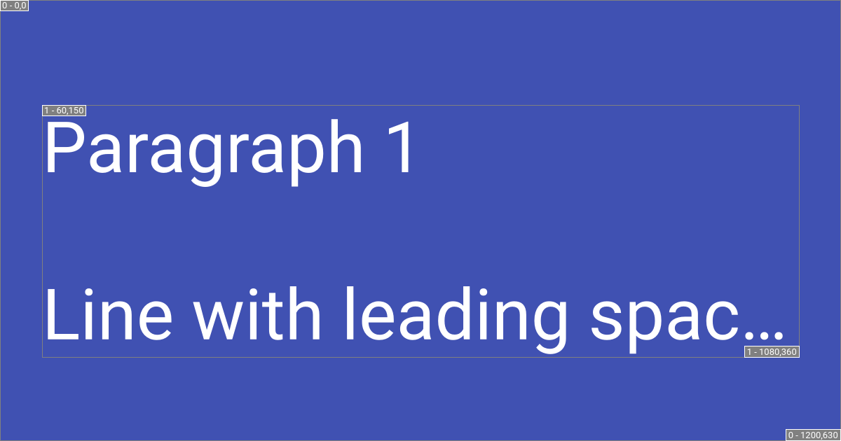
The text content is pre-processed (after parsed from Jinja syntax) to allow comprehensive wrapping of words. This is beneficial for long winded programmatic names.
Caution
Beware that leading and trailing whitespace is stripped from each line.
Using an API name as the page title¶:title: sphinx_social_cards.validators.LayerTypographyDataclass._fg_color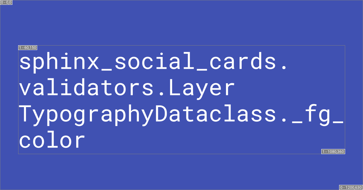
- align : Literal['start top', 'start center', 'start bottom', 'center top', 'center', 'center center', 'center bottom', 'end top', 'end center', 'end bottom']
The alignment of text used. This is a string in which the space-separated words respectively describe the horizontal and vertical alignment.
Alignment Options¶ start topcenter topend topstart centercenterorcenter centerend centerstart bottomcenter bottomend bottom
- color : Color | Linear_Gradient | Radial_Gradient | Conical_Gradient | None
The color to be used for the displayed text. If not specified, then this defaults to
cards_layout_options.color.Seealso
Please review Choosing a color section for more detail.
- line : Line
The
linespecification which sets theamountof lines and theheightof each line. This is used to calculate the font’s size.
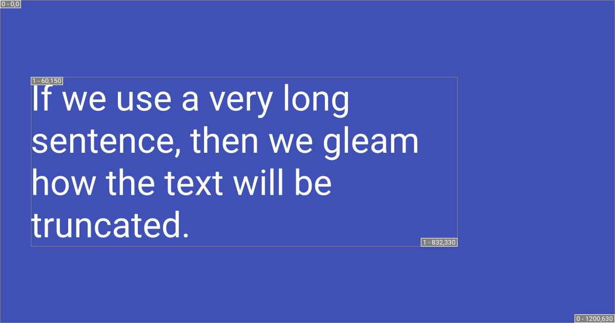
- overflow : bool
Set this option to
trueto automatically shrink the font size enough to fit within the layer’ssize. By default (false), text will be truncated when the layer’ capacity is reached, and an ellipsis will be added.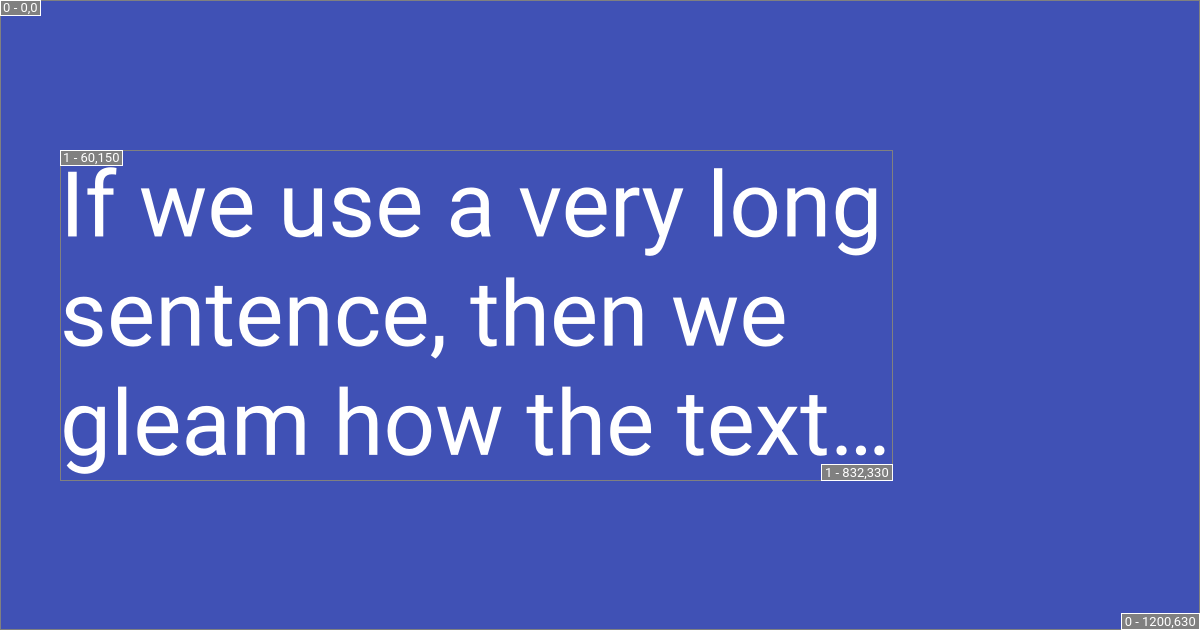
- font : Font | None
The specified font to use. If not specified, then this defaults to values in
cards_layout_options.font.Seealso
Please review Choosing the font section.
Typography Line specification
- class Line
These properties are used to calculate the font’s size based on the layer’s absolute maximum
size.- amount : Annotated[int, FieldInfo(annotation=NoneType, required=True, metadata=[Gt(gt=0)])]
The maximum number of lines that can be used in the layer.
- height : Annotated[float, FieldInfo(annotation=NoneType, required=True, metadata=[Gt(gt=0)])]
The relative height allotted to each line. This has a direct affect on spacing between lines because each layer has an absolute maximum
size.0.75means each line can have 75% of the appropriately available line height. Text will be smaller, but the layer’s height will not be fully used.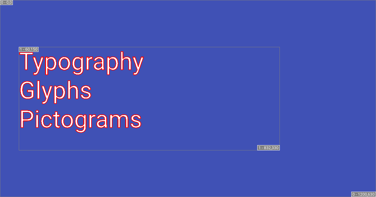
1means each line can have the full appropriately available line height. Text will be large enough to fit within of the appropriately available line height.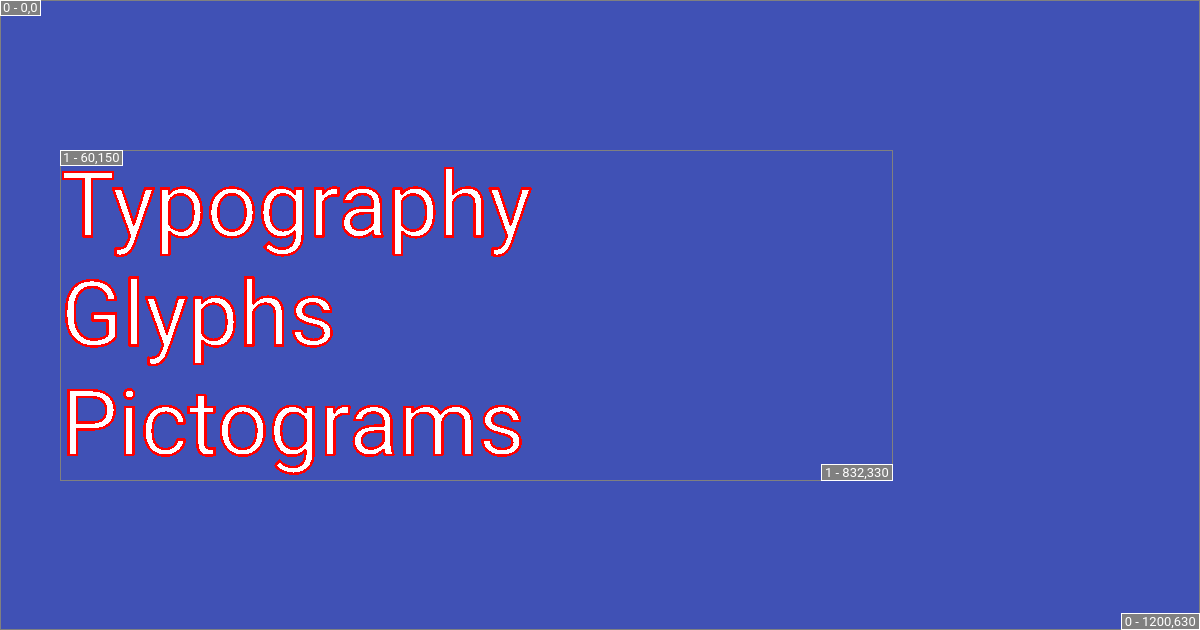
1.25means each line can have 125% of the appropriately available line height. Text will be bigger but the space between lines will be smaller (can even be negative).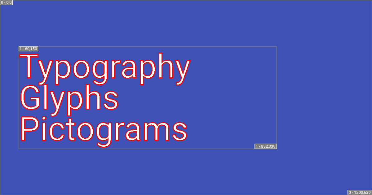
2.0means each line can have 200% of the appropriately available line height. Text should never exceed the layer size, thus spacing between lines is adjusted accordingly.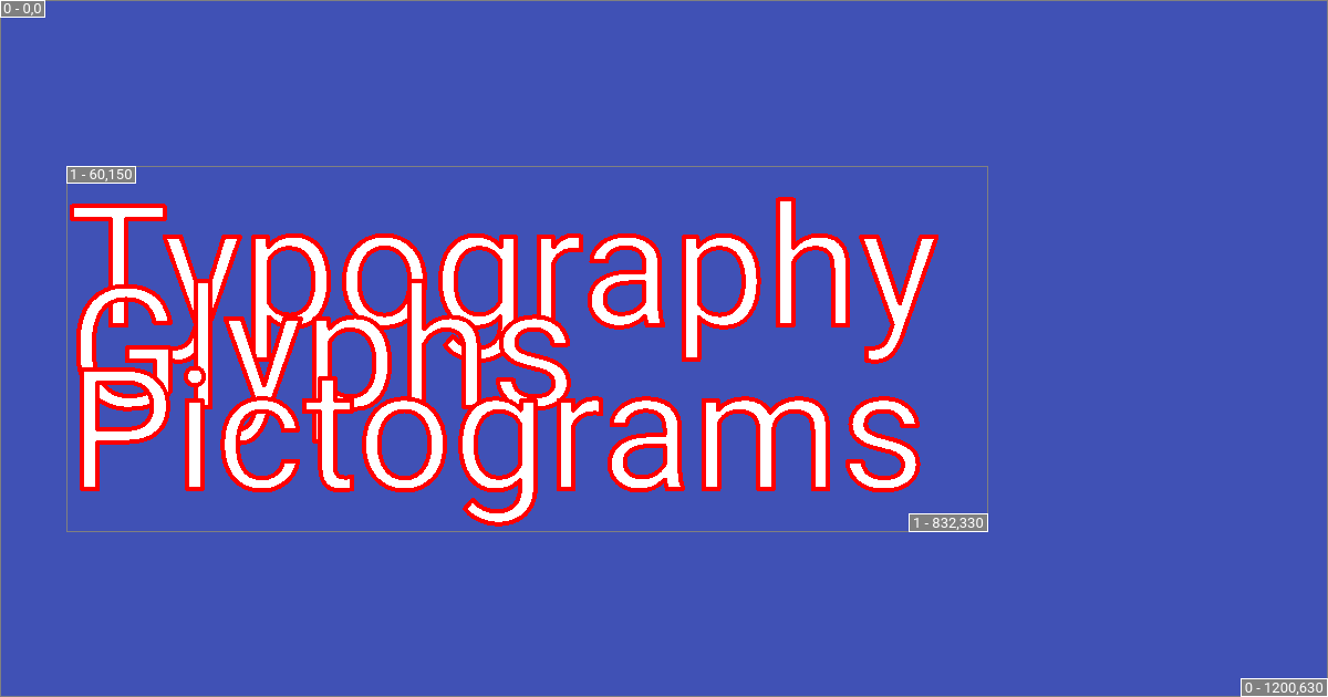
0.5means each line can have 50% of the appropriately available line height. Notice the line height is directly related to height of the layer.
Font specification
- class Font
The specification that describes the font to be used.
Seealso
Please review the Choosing the font section.
- family : str
This option specifies which font to use for rendering the social card, which can be any font hosted by Fontsource. Default is
"Roboto"if not using the sphinx-immaterial theme. However, the sphinx-immaterial theme’sfontoption is used as a default if that theme is used.If the font specified is not a Roboto font and cannot be fetched from Fontsource, then an exception is raised and the docs build is aborted.
- style : str
The style of the font to be used. Typically, this can be
italicornormal, but it depends on the styles available for the chosenfamily.There is no inline style parsing.
Due to the way
pillowloads fonts, there’s no way to embed syntactic inline styles for individual words or phrases in the text content.**bold**and*italic*will not render as bold and italic.Instead, the layout customization could be used to individually layer stylized text.
- weight : Annotated[int, FieldInfo(annotation=NoneType, required=True, metadata=[Gt(gt=0)])]
The weight of the font used. If this doesn’t match the weights available, then the first weight defined for the font is used and a warning is emitted. Default is
400.