Customized Layouts
Layouts are written in YAML syntax. Before starting to create a custom layout, it is a good idea
to study the pre-designed layouts, to get a better
understanding of how they work. Then, create a new layout and reference it in the
social_cards conf.py option (or within the social-card directive’s argument).
layouts/custom.yml is located adjacent to conf.py file¶size: { width: 1200, height: 630 }
layers: []
social_cards = { # (1)!
    "cards_layout_dir": "layouts",
    "cards_layout": "custom"
}
The required
site_urlis elided here for brevity.
.. social-card:: {
        "cards_layout_dir" = "layouts",
        "cards_layout" = "custom",
    }
Card Layout Options
- class Cards_Layout_Options
There are some options that are used as default values for the layout’s subsequent layers. These values are set with
cards_layout_optionsand are added to thelayout.*jinja context (for customizable re-use inlayerattributes).Seealso
This section heavily relies on knowledge about Using Jinja Syntax within the Layout
- background_image : Annotated[str | Path, AfterValidator(func=_validate_path)] | None
The fallback value used for a layer’s
background.imageattribute. Default isNone. This image will not be shown if thebackground_colorhas no alpha channel (transparency) value.conf.py¶social_cards = { "description": "Generate social media cards for documentation pages with Sphinx", "site_url": "https://sphinx-social-cards.readthedocs.io/en/latest/", "cards_layout_options": { "background_image": "images/rainbow.png" } }my-layout.yml¶layers: - background: image: '{{ layout.background_image }}'
- background_color : Color | Linear_Gradient | Radial_Gradient | Conical_Gradient | None
The fallback value used for a layer’s
background.colorattribute in most pre-designed layouts. By default, this value is set to thepalette[primary] color or"#4051B2"for themes other than sphinx-immaterial.conf.py¶social_cards = { "description": "Generate social media cards for documentation pages with Sphinx", "site_url": "https://sphinx-social-cards.readthedocs.io/en/latest/", "cards_layout_options": { "background_color": "rgb(90, 32, 166)" } }my-layout.yml¶layers: - background: color: '{{ layout.background_color | yaml }}'
- color : Color | Linear_Gradient | Radial_Gradient | Conical_Gradient | None
The color used for the foreground text in most pre-designed layouts. By default, this will be computed as
"white"or"black"based on thebackground_color.conf.py¶social_cards = { "description": "Generate social media cards for documentation pages with Sphinx", "site_url": "https://sphinx-social-cards.readthedocs.io/en/latest/", "cards_layout_options": { "color": "#0FF1CE" } }my-layout.yml¶size: { width: 600, height: 125 } layers: - background: { color: black } - typography: content: "'{{ layout.color }}'" color: '{{ layout.color | yaml }}' align: center line: { amount: 2 }
- accent : Color | Linear_Gradient | Radial_Gradient | Conical_Gradient | None
The color used as a foreground accentuating color. By default, this value is set to the
palette[accent] color or"#4051B2"for themes other than sphinx-immaterial.conf.py¶social_cards = { "description": "Generate social media cards for documentation pages with Sphinx", "site_url": "https://sphinx-social-cards.readthedocs.io/en/latest/", "cards_layout_options": { "accent": "hsl(35.7, 100%, 65.1%)" } }my-layout.yml¶layers: - background: color: '{{ layout.accent| yaml }}'
- font : Font | None
The
fontspecification to be used.Seealso
Please review Choosing the font section.
conf.py¶social_cards = { "description": "Generate social media cards for documentation pages with Sphinx", "site_url": "https://sphinx-social-cards.readthedocs.io/en/latest/", "cards_layout_options": { "font": { "family": "Roboto", "style": "italic" } } }my-layout.yml¶size: { width: 600, height: 125 } layers: - background: { color: black } - typography: content: '{{ layout.font.family }}' '{{ layout.font.style }}' line: { amount: 2 } align: center
- logo : Icon | None
The icon used for branding of the site. By default, this will be the
html_logo(or the sphinx-immaterial theme’sicon[logo]).In most pre-designed layouts, the image’s
coloris used as is. This behavior can be changed by setting this option.Most pre-designed layouts use the
iconmetadata field to overridden theimagevalue per page.conf.py¶social_cards = { "description": "Generate social media cards for documentation pages with Sphinx", "site_url": "https://sphinx-social-cards.readthedocs.io/en/latest/", "cards_layout_options": { "logo": { "image": "images/message.png", "color": "#4051B2" } } }my-layout.yml¶size: { width: 250, height: 250 } layers: - background: { color: black } - icon: image: '{{ layout.logo.image }}' color: '{{ layout.logo.color | yaml }}'
Layout Attributes
- class Layout
The
sizeattribute is not required (seewidthandheightfor default values), but thelayersattribute is required.Each layout supports these options:
- size : Size
The card’s absolute maximum
size. Anylayerswith nosizespecified will fallback to thislayout.size. If this is not specified, then the layout uses the defaultwidthandheightvalues.
- layers : list[Layer]
A YAML list of layers in the layout that define the entire content of the layout.
Positioning Attributes
The layout’s and individual layer’s size and the individual layer’s offset are
defined in pixels. The size is defined by a width and height
property, and the offset is defined by x and y properties:
size: { width: 300, height: 300 } # the layout maximum size
layers:  # each layer in this list is denoted with a dash ('-')
  - {}
  - size: { width: 240, height: 240 }
    offset: { x: 30, y: 30 }
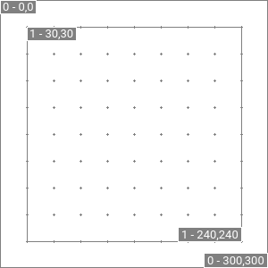
The layer outline and grid are visible because we enabled debug in the
social_cards configuration. The rest of the image is transparent because there
are no layers with any actual content specified (like background, icon or
typography).
Upon closer inspection you’ll notice that