Configuration
To use this extension, it must be added to your conf.py file’s extensions option.
extension = [
    # other extensions...
    "sphinx_social_cards",
]
There are some required configuration values (and other optional values) that can be specified in
conf.py file as well. So, the social_cards option also needs to be added to conf.py.
- class Social_Cards
A
dictof configurations related to generating social media cards. Each attribute equates to a supported configuration option.Some options use another data class to validate its values, so be mindful of the documented attributes’ datatype.
A minimal/required configuration in conf.py¶social_cards = { "site_url": "https://2bndy5.github.io/sphinx-social-cards", "description": "Generate social media preview cards for your sphinx documentation.", }- site_url : str
This required option will be the base URL that social media platforms use to fetch the social card’s image.
- description : str
This option will be used as the description metadata for all generated pages. It can be overridden for individual pages using the
descriptionmetadata role.
- enable : bool
Set this option to
Falseto disable automatic generation of social cards for each page. Thesocial-carddirective can be used to invoke or override social card generation for a specific page.
- cards_layout : str
The layout file’s name used to generate the social cards. If using a custom-made layout (not a pre-made layout), then the layout file must be a YAML file. If the the
cards_layout_diris specified, then that path is searched for a matching layout before searching the default path of pre-made layouts.This extension ships with some pre-made layouts for convenience.
Full
defaultlayout syntax#% block color_vals %# bg_color: &bg_color '{{ layout.background_color | yaml }}' fg_color: &fg_color '{{ layout.color | yaml }}' #% endblock %# layers: # the base layer for the background - background: color: *bg_color image: >- #% if layout.background_image -%# '{{ layout.background_image }}' #%- endif %# # the layer for the logo image - size: { width: 150, height: 150 } offset: { x: 990, y: 60 } icon: image: >- #% if page.meta.icon -%# '{{ page.meta.icon }}' #%- elif layout.logo.image -%# '{{ layout.logo.image }}' #%- endif %# color: '{{ layout.logo.color | yaml }}' # the layer for the site's name - offset: { x: 60, y: 60 } size: { width: 920, height: 60 } typography: content: '{{ config.docstitle }}' align: start center color: *fg_color # the layer for the page's title - size: { width: 920, height: 300 } offset: { x: 60, y: 150 } typography: content: >- #% if page.meta.title -%# '{{ page.meta.title }}' #%- elif page.title -%# '{{ page.title }}' #%- endif %# line: # height: 0.85 amount: 3 font: weight: 500 color: *fg_color # the layer for the site's (or page's) description - offset: { x: 60, y: 480 } size: { width: 1080, height: 90 } typography: content: >- #% if page.meta and page.meta.description -%# '{{ page.meta.description }}' #%- else -%# '{{ config.site_description }}' #%- endif %# line: height: 0.87 amount: 2 align: start bottom color: *fg_colorconf.py¶social_cards = { "description": "Generate social media cards for documentation pages with Sphinx", "site_url": "https://sphinx-social-cards.readthedocs.io/en/latest/", "cards_layout": "default" }
Full
default/accentlayout syntax#% extends "default.yml" %# #% block color_vals %# bg_color: &bg_color '{{ layout.accent | yaml }}' fg_color: &fg_color '{{ layout.color | yaml }}' #% endblock %#conf.py¶social_cards = { "description": "Generate social media cards for documentation pages with Sphinx", "site_url": "https://sphinx-social-cards.readthedocs.io/en/latest/", "cards_layout": "default/accent" }
Full
default/invertedlayout syntax#% extends "default.yml" %# #% block color_vals %# bg_color: &bg_color '{{ layout.color | yaml }}' fg_color: &fg_color '{{ layout.background_color | yaml }}' #% endblock %#conf.py¶social_cards = { "description": "Generate social media cards for documentation pages with Sphinx", "site_url": "https://sphinx-social-cards.readthedocs.io/en/latest/", "cards_layout": "default/inverted" }
Full
default/variantlayout syntaxsize: { width: 1200, height: 630 } layers: # the base layer for the background - background: color: '{{ layout.background_color | yaml }}' image: '{{ layout.background_image }}' # the layer for an embedded icon in the background - size: { width: 570, height: 570 } offset: { x: 820, y: 30 } #% block background_icon -%# icon: image: >- #% if page.meta.icon -%# '{{ page.meta.icon }}' #%- elif layout.logo.image -%# '{{ layout.logo.image }}' #%- endif %# color: >- #% if layout.background_color in ('#000', '#000000', 'rgb(0, 0, 0)', 'hsl(0, 0%, 0%)', 'black') -%# #FFFFFF #%- else -%# #000000 #%- endif -%# 40 #%- endblock %# # the layer for the logo image - size: { width: 90, height: 90 } offset: { x: 60, y: 60 } icon: image: '{{ layout.logo.image }}' color: #% if layout.logo.color %#'{{ layout.logo.color | yaml }}'#% else %#null#% endif %# # the layer for the site's name - offset: { x: 180, y: 75 } size: { width: 960, height: 60 } typography: content: '{{ config.docstitle }}' line: height: 0.85 amount: 1 align: start center # the layer for the page's title - size: { width: 1080, height: 270 } offset: { x: 60, y: 180 } typography: content: >- #% if page.meta.title -%# '{{ page.meta.title }}' #%- elif page.title -%# '{{ page.title }}' #%- endif %# line: # height: 1.25 amount: 3 font: weight: 500 # the layer for the site's (or page's) description - offset: { x: 60, y: 480 } size: { width: 1080, height: 90 } typography: content: >- #% if page.meta.description -%# '{{ page.meta.description }}' #%- else -%# '{{ config.site_description }}' #%- endif %# line: height: 0.87 amount: 2 align: start bottomconf.py¶social_cards = { "description": "Generate social media cards for documentation pages with Sphinx", "site_url": "https://sphinx-social-cards.readthedocs.io/en/latest/", "cards_layout": "default/variant" }
Full
opengraphlayout syntax#% block font_colors %# project_desc_color: &project_desc_color 'rgb(88, 94, 99)' title_url_color: &title_url_color 'rgb(47, 54, 61)' #% endblock %# size: {width: 1200, height: 630} layers: # the base layer for the background #% block background -%# - background: linear_gradient: preset: PremiumWhite start: {} end: { x: 400, y: 210} spread: reflect #%- endblock %# # the layer for the logo image - size: { width: 150, height: 150 } offset: { x: 990, y: 60 } icon: image: >- #% if page.meta.icon -%# '{{ page.meta.icon }}' #%- elif layout.logo.image -%# '{{ layout.logo.image }}' #%- endif %# color: '{{ layout.logo.color | yaml }}' # the layer for the site's name - offset: { x: 60, y: 60 } size: { width: 920, height: 45 } typography: content: "'{{ config.docstitle }}'" line: # height: 0.8 amount: 1 color: *project_desc_color align: start center # the layer for page's title - size: { width: 920, height: 310 } offset: { x: 60, y: 120 } typography: content: >- #% if page.meta.title -%# '{{ page.meta.title }}' #%- elif page.title -%# '{{ page.title }}' #%- endif %# line: height: 1.25 amount: 4 color: *title_url_color font: weight: 500 # the layer for the site's (or page's) description - offset: { x: 60, y: 450 } size: { width: 1080, height: 60 } typography: content: >- #% if page.meta.description -%# '{{ page.meta.description }}' #%- else -%# '{{ config.site_description }}' #%- endif %# line: height: 1.05 amount: 2 align: start bottom color: *project_desc_color # the layer for the base URL - offset: { x: 60, y: 522 } size: { width: 1010, height: 38 } typography: content: '{{ config.site_url }}' color: *title_url_color font: weight: 700 align: start center # the layer for the watermark icon at the bottom-right - size: { width: 60, height: 60 } offset: { x: 1080, y: 520 } #% block watermark_icon -%# icon: image: >- #% if page.meta.icon -%# '{{ page.meta.icon }}' #%- else -%# sphinx_logo #%- endif %# color: rgb(132, 146, 175) #%- endblock %# # the layer for a colored bar at the bottom - size: { width: 1200, height: 30 } offset: { x: 0, y: 600} background: color: '{{ layout.accent | yaml }}'conf.py¶social_cards = { "description": "Generate social media cards for documentation pages with Sphinx", "site_url": "https://sphinx-social-cards.readthedocs.io/en/latest/", "cards_layout": "opengraph" }
Full
bloglayout syntax#% block metadata_color %# meta_color: &meta_color 'rgb(102, 102, 102)' #% endblock %# icon_size: &icon_size size: width: 40 height: 40 meta_info_size: &meta_info_size size: width: 160 height: 120 meta_info_lines: &meta_info_lines line: amount: 3 height: 1.1 avatar_size: &avatar_size size: width: 120 height: 120 size: { width: 1200, height: 630 } layers: # the layer for the background #% block background -%# - background: conical_gradient: preset: AboveTheSky center: { x: 600, y: 630 } angle: -90 #%- endblock %# # the layer for the bottom bar - size: { width: 1200, height: 30 } offset: { x: 0, y: 600 } background: color: '{{ layout.accent | yaml }}' # the layer for the title's left border - size: { width: 40, height: 360 } offset: { x: 40, y: 40 } rectangle: color: '{{ layout.accent | yaml }}' radius: 19 corners: ["top left", "bottom left"] mask: size: { width: 20, height: 360 } background: { color: white } # the layer for the page's title - size: { width: 1080, height: 300 } offset: { x: 80, y: 40 } typography: color: black content: >- #% if page.meta.title -%# '{{ page.meta.title }}' #%- elif page.title -%# '{{ page.title }}' #%- endif %# line: amount: 3 font: family: Roboto Slab weight: 500 # the layer for the list of hashtags' icon - offset: { x: 80, y: 350 } <<: *icon_size icon: image: >- #% if page.meta.tags -%# fontawesome/solid/tags #%- endif %# color: *meta_color # the layer for the list of hashtags - size: { width: 1030, height: 40 } offset: { x: 130, y: 350 } typography: color: *meta_color content: >- #% if page.meta.tags -%# #'{{ page.meta.tags.split(', ') | join(', #') }}' #%- endif %# line: amount: 1 height: 0.9 align: start center # the layer for the read-time's icon - offset: { x: 40, y: 450 } <<: *icon_size icon: image: >- #% if page.meta['read-time'] -%# fontawesome/solid/stopwatch #%- endif %# color: *meta_color # the layer for the read-time - offset: { x: 90, y: 450 } <<: *meta_info_size typography: color: *meta_color content: >- #% if page.meta['read-time'] -%# '{{ page.meta['read-time'] }}' #%- endif %# <<: *meta_info_lines # the layer for the date's icon - offset: { x: 260, y: 450 } <<: *icon_size icon: image: >- #% if page.meta.date or config.today -%# fontawesome/solid/calendar #%- endif %# color: *meta_color # the layer for the date - offset: { x: 310, y: 450 } <<: *meta_info_size typography: color: *meta_color content: >- #% if page.meta.date -%# '{{ page.meta.date }}' #%- elif config.today -%# '{{ config.today }}' #%- endif %# <<: *meta_info_lines # the layer for the language icon - offset: { x: 480, y: 450 } <<: *icon_size icon: image: >- #% if page.meta.language or config.language -%# fontawesome/solid/language #%- endif %# color: *meta_color # the layer for the language - offset: { x: 530, y: 450 } <<: *meta_info_size typography: color: *meta_color content: >- #% if page.meta.language -%# '{{ page.meta.language | title }}' #%- elif config.language -%# '{{ config.language | title }}' #%- endif %# <<: *meta_info_lines # the layer for the author's name - offset: { x: 700, y: 450 } size: { width: 330, height: 120 } typography: content: >- #% if page.meta.author -%# '{{ page.meta.author }}' #%- elif config.author -%# '{{ config.author }}' #%- endif %# line: amount: 2 height: 1.1 font: weight: 500 overflow: on color: black align: end center # the layer for the author's avatar - offset: { x: 1047, y: 457 } size: { width: 106, height: 106 } background: image: >- #% if page.meta.avatar -%# '{{ page.meta.avatar }}' #%- endif %# mask: ellipse: color: black size: { width: 106, height: 106 } # the layer for the avatar's border - offset: { x: 1040, y: 450 } size: { width: 120, height: 120 } ellipse: border: width: 8 color: #% if page.meta.avatar %#'{{ layout.accent | yaml }}'#% else %#null#% endif %#my-document.rst (meta-data)¶:read-time: 5 minutes :avatar: images/avatar.jpg :tags: sphinx, social, cardsconf.py¶social_cards = { "description": "Generate social media cards for documentation pages with Sphinx", "site_url": "https://sphinx-social-cards.readthedocs.io/en/latest/", "cards_layout": "blog" }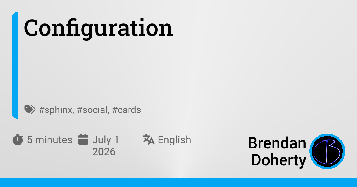
- cards_layout_dir : list[Annotated[str | Path, AfterValidator(func=_validate_path)]]
The list of paths (absolute or relative to conf.py) where the
cards_layoutis located. In the case of similarly named layout files, the order in this list takes precedence.
- cards_layout_options : Cards_Layout_Options
A set (
dict) of options that can be accessed via thelayout.*jinja context. Seecards_layout_optionsfor more detail.
- cards_exclude : list[str] | set[str]
This
listcan be used to exclude certain pages from generating social cards. Default is an emptylist. Each item must be relative to the directory containing the conf.py file.Glob patternsare supported, and file suffixes are only required when specifying an individual document source.exclude all docs in the*-generateddirectories and a file namedchangelog¶social_cards = { "cards_exclude": [ "*-generated/*", # (1)! "changelog.rst", ] }Use
**to include all subdirectories
Note
This option does not affect the
social-carddirective.
- cards_include : list[str] | set[str]
This
listcan be used to include certain pages fromcards_excludelist. Default is an emptylist. Each item must be relative to the directory containing the conf.py file.Glob patternsare supported, and file suffixes are only required when specifying an individual document source.include all docs in theblog-postsfolder¶social_cards = { "cards_include": [ "blog-posts/*", ] }
- image_paths : list[Annotated[str | Path, AfterValidator(func=_validate_path)]]
A list of directories that contain images to be used in the creation of social cards. By default, the path to the directory containing the conf.py file is automatically added to this list. Each entry in this list can be an absolute path or a path relative to the conf.py file.
This extension includes bundled SVG icons with distribution. The path to the bundled icons are appended to this list automatically.
- Bundled Icons:
name
Referenced in layouts using
Sphinx logo
sphinx_logomaterial/<icon-name>fontawesome/<brands|regular|solid>/<icon-name>octicons/<icon-name>simple/<icon-name>
- debug : Debug | bool
A field to specify layout debugging helpers. See Debugging Layouts for more detail.
- path : str
This option specifies where the generated social card images will be written to. It’s normally not necessary to change this option. Defaults to the documentation’s output in the subfolder ‘_static/social_cards’.
- cache_dir : str | Path
The directory (relative to the conf.py file) that is used to store cached data for generating the social cards. By default, this will create/use a directory named
"social_cards_cache"located adjacent to the conf.py file.Caching Fonts
This path is also used to cache the downloaded fonts except for the distributed cache of Roboto font variants. If this path is checked into a git remote (such as repository hosted on GitHub), then the cache of fonts can be shared with project collaborators or reused in a Continuous Integration workflow.
.gitignore¶# ignore cached images, but check in cached fonts doc/social_cards_cache/** !docs/social_cards_cache/fonts/*
Choosing the font
Fonts are fetched from Fontsource and cached in the cache_dir folder. They can be specified in
multiple places. The order of precedence is:
Using the
cards_layout_options.fontwhich is specified in the conf.py file undersocial_cards.cards_layout_optionsfield.in conf.py¶social_cards = { "cards_layout_options": { "font": { "family": "Roboto", } } }The
typography.fontattribute allows for finite control over each layer of text when using Customized Layouts.my-custom-layout.yml¶layers: - typography: font: family: Roboto
Both approaches use the same font specification.
Note
The Roboto fonts are cached and distributed with this extension.
If fonts cannot be fetched from Fontsource (and they are not already cached in the
cache_dir or the distributed cache of Roboto font variants), then an exception will be
raised.
Weights over styles
Fontsource does not offer bold or thin (AKA narrow) styles of fonts. Instead they
offer a multitude of weights. The rule of thumb is to to use
100instead ofthin400instead ofregular700instead ofbold
Fonts from Fontsource typically have only normal or italic styles. The weights
available vary per font family. When a specified font does not provide the specified weight,
then the closest available weight is used.
Variable and icon fonts are not supported
Since this extension uses pillow to render fonts, the support for using pillow with variable
fonts has not been implemented. This is because pillow requires additional dependencies to
work with variable fonts.
Icon fonts, namely the material icon fonts from Google via Fontsource, are also not supported because they are designed to be used in a browser with CSS capability. Implementing icon fonts without CSS, would require using special string syntax in the yaml layout, and it just doesn’t seem worth it.
If someone is so inclined to add support for variable and icon fonts, then a Pull Request would be welcome.
Non-English languages
Some fonts will render boxes because they do not contain CJK characters, like for example the
default font, Roboto. If any text (eg. the project name,
description, or page title) contain CJK characters, then choose another
font from Fontsource which comes with CJK characters.
chinese-traditional subset¶social_cards = {
"cards_layout_options": {
"font": {
"family": "Noto Sans TC",
"subsets": "chinese-traditional",
}
}
}
chinese-simplified subset¶social_cards = {
"cards_layout_options": {
"font": {
"family": "Noto Sans SC",
"subsets": "chinese-simplified",
}
}
}
japanese subset¶social_cards = {
"cards_layout_options": {
"font": {
"family": "Noto Sans JP",
"subsets": "japanese",
}
}
}
korean subset¶social_cards = {
"cards_layout_options": {
"font": {
"family": "Noto Sans KR",
"subsets": "korean",
}
}
}
Choosing a color
All color fields related to this extension (via cards_layout_options or in layer
attributes) can be specified as a Solid color syntax or a Gradient color specification.
Solid color syntax
- class Color
Represents a color.
A solid color can be specified in the following string forms:
-
social_cards = { "cards_layout_options": { "color": "Black", # NOTE case insensitivity "background_color": "azure", } }layers: - background: color: Black # NOTE case insensitivity - ellipse: color: azure -
social_cards = { "cards_layout_options": { "color": "#FFFFFF", # NOTE case insensitivity "background_color": "#FFffFF80", # 50% transparent } }layers: - background: color: '#FFFFFF' # NOTE case insensitivity - ellipse: color: '#FFffFF80' # 50% transparent -
social_cards = { "cards_layout_options": { "color": "rgb(255, 255, 255)", "background_color": "rgba(255, 255, 255, 0.5)" # 50% transparent, } }layers: - background: color: 'rgb(255, 255, 255)' - ellipse: color: 'rgba(255, 255, 255, 0.5)' # 50% transparent -
social_cards = { "cards_layout_options": { "color": "hsl(270, 60%, 70%)", "background_color": "hsl(270, 60%, 70%, .5)" # 50% transparent, } }layers: - background: color: 'hsl(270, 60%, 70%)' - ellipse: color: 'hsl(270, 60%, 70%, .5)' # 50% transparent
Note
The alpha value (transparency) is ignored for
social_cards.debug.color-
Gradient color specification
Being powered by Qt for Python, this extension supports rendering gradients of colors.
Complete details about using Gradient Colors is described separately for each supported gradient orientation:
Be sure to also check out the Preset Gradients for a complete list of conveniently
pre-defined list of colors (with generated examples).
Metadata
Changing the title
By default all generated social cards’ title will use the page’s top-level heading, but it may be desirable to adapt the title to the page for which the social card represents. To do this, use one of the following options:
the title directive
.. title:: Some page-specific titlethe meta directive
This option is more advanced as it allows direct manipulation of the resulting meta element(s). However, this tactic will ensure the metadata is present in the generated HTML despite whatever theme is used.
.. meta::
  :title: Some page-specific title
Changing the description
By default all generated social cards’ description will use the description,
but it may be desirable to adapt the description to the page for which the social card represents.
To do this, use one of the following options:
the meta directive
This option is more advanced as it allows direct manipulation of the resulting meta element(s). However, this tactic will ensure the metadata is present in the generated HTML despite whatever theme is used.
.. meta::
  :description: Some page-specific description.
Changing the icon
By default all generated social cards’ icon will use the Cards_Layout_Options.logo,
but it may be desirable to adapt the icon to the page for which the social card represents.
Changing the icon may not be consistent for different layouts.
Some layouts use the icon differently from the html_logo (or
icon[logo] for the sphinx-immaterial theme).
When a layout uses an icon is used instead of the logo (as with the default layout), then the color of the icon
is not altered.
To do this, use either the icon or the card-icon metadata field.
Blog front matter
Some of the front matter supported by the ABlog sphinx extension is used in the the pre-defined blog
cards_layout:
Debugging Layouts
- class Debug
To ease creation of custom layouts, optional debugging glyphs can be
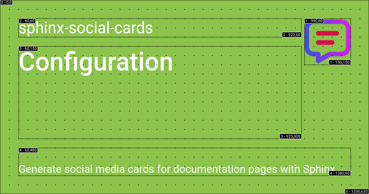
enabled in the generated social card images.conf.py¶social_cards = { "description": "Generate social media cards for documentation pages with Sphinx", "site_url": "https://sphinx-social-cards.readthedocs.io/en/latest/", "debug": True }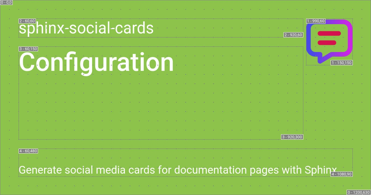
Each layer will have a boundary box drawn with some text to indicate the layer number (as ordered in the list of layout
layers) and corresponding orientation.The text in the top-left corner indicates the layer number,
xandy.The text in the bottom-right corner indicates the layer number,
widthandheight.
- grid_step : int
If
gridis enabled, then thisintspecifies the distance (in pixels) between each dot in the grid. Defaults to30.conf.py¶social_cards = { "description": "Generate social media cards for documentation pages with Sphinx", "site_url": "https://sphinx-social-cards.readthedocs.io/en/latest/", "debug": { "enable": True, "grid_step": 15 } }
- color : Color
The color used to draw the debugging outlines, labels, and grid. The color for the debugging text is automatically set based on this color value.
conf.py¶social_cards = { "description": "Generate social media cards for documentation pages with Sphinx", "site_url": "https://sphinx-social-cards.readthedocs.io/en/latest/", "debug": { "enable": True, "color": "black" } }